The best fonts for captions on Reels, TikTok and Shorts
By Vansh · Updated
A caption font has a harder job than most: it has to be read in a second, on a small screen, over a moving picture, often while the viewer is scrolling. The good news is that a handful of free fonts do it brilliantly.
What makes a good caption font
- Heavy weights. Bold, extra bold or black letters hold up at small sizes and over busy footage. Thin fonts disappear.
- Open, simple shapes. Letters like a, e and s should be easy to tell apart at a glance. Decorative or script fonts slow reading down.
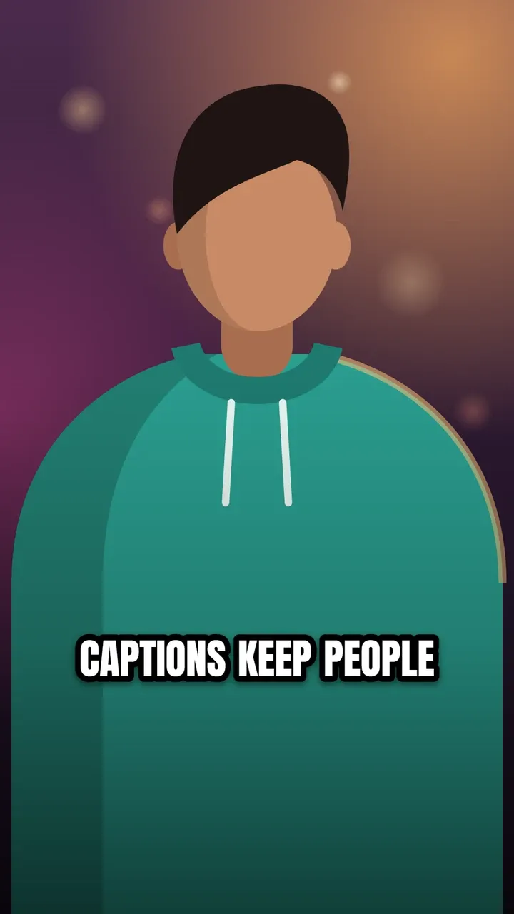
- Works in capitals. Many caption styles use ALL CAPS, so the capitals need to look good on their own.
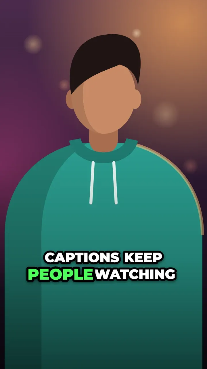
- Takes an outline well. A thick black outline or a shadow is what keeps white text readable on bright backgrounds. Chunky fonts carry an outline better than delicate ones.
- A licence that allows commercial use. Text in your video is part of what you publish. If you monetise, sell or promote anything, the font’s licence matters (more on that below).
Eight free fonts that work
These are the fonts in the CaptionOnReel editor. All of them are free for commercial use under the SIL Open Font License.
| Font | Character | Good for | Used by these styles |
|---|---|---|---|
| Montserrat | Wide, geometric, weights up to Black | The all-rounder: bold, modern, readable | Karaoke, Hormozi-style, Pop and most others |
| Poppins | Rounded and friendly | Lifestyle, food, travel, anything warm | Bounce, Wave, Pill |
| Inter | Neutral, very clear in sentence case | Interviews, explainers, longer videos | Minimal, Typewriter, Bar |
| Anton | Tall, condensed, one heavy weight | Memes, sports, headline-style captions | Impact |
| Bebas Neue | Condensed, capitals only | Short, punchy words and titles | Any style, via the font menu |
| Oswald | Condensed, several weights | A lighter take on the condensed look | Any style, via the font menu |
| Archivo Black | Wide and very heavy | Strong and serious without looking cartoonish | Any style, via the font menu |
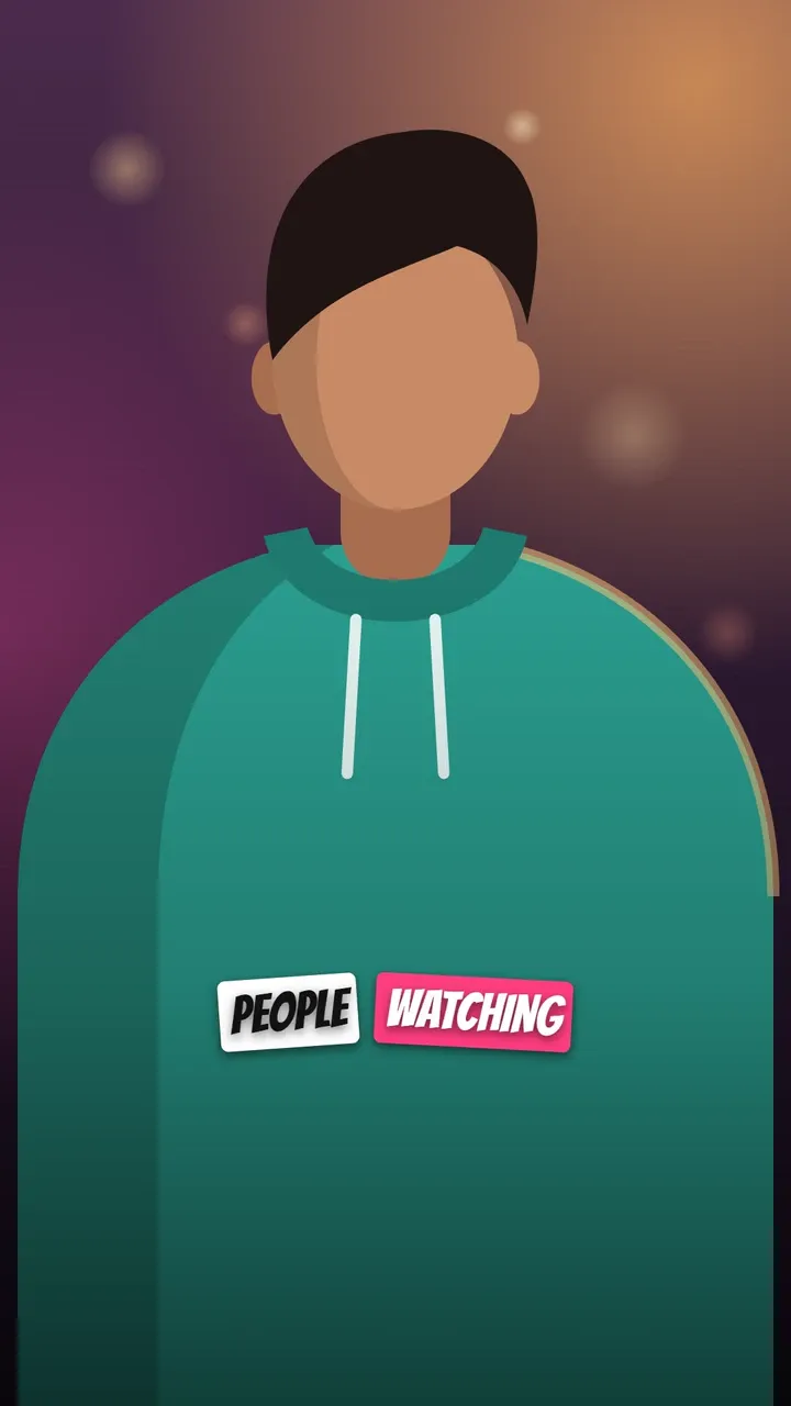
| Bangers | Comic-book capitals | Fun, playful and MrBeast-style captions | Sticker |
If you only remember one: Montserrat ExtraBold or Black, in ALL CAPS, white with a thick black outline. It is the look of most high-performing short videos for a reason.
A word on licences
Many fonts on free-font websites are “free for personal use” only, which does not cover videos for a business, a brand deal or a monetised channel. Some popular caption fonts are listed with different licences on different sites. Before using a font in published videos, read the licence file that comes with it.
Fonts under the SIL Open Font License (OFL), like the eight above, are free to use commercially, including burned into videos. That is why the editor includes only OFL fonts. For example, if you like the comic look of MrBeast’s captions, see the MrBeast captions font for a free alternative.
Settings that matter as much as the font
- Size. On a 1080-pixel-wide video, a font size of roughly 56 to 96 pixels covers most caption styles; the editor’s styles start between 52 and 96. Use the letter size and caption size controls and check the preview at phone size.
- Outline and shadow. A black outline (width 6 to 12) or a soft shadow makes white text readable on any footage. Without one, use a background such as a pill or a bar.
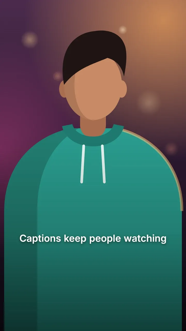
- Case. ALL CAPS reads as energetic; sentence case reads as calm and is easier for longer lines.
- Words per line. 2 or 3 for fast videos, up to 5 or 6 for calm styles. Fewer words mean bigger text.
- Colour. White text with one highlight colour (yellow, green or your brand colour) is the classic combination. Keep the same colours across videos so people recognise your style.
Matching fonts to content
- Coaching, business, education: Montserrat Black or Anton, with a single highlight colour. See Hormozi-style captions.
- Lifestyle, beauty, food: Poppins in sentence case, with a soft highlight.
- Interviews, documentary, serious topics: Inter, sentence case, with a shadow or a bar.
- Comedy, gaming, kids: Bangers or Archivo Black, big and bold.
Try them on your own video: open the editor, pick a style, then switch fonts in the style panel and watch the preview change.